Print Design
Here are examples of work I did while attending DePaul University. All projects are made exclusively for print, except my interpretation of the Lakeview High School 1978 yearbook, which can also work as a one-page website and zine.
Black Sabbath
The purpose of this assignment was to practice managing large bodies of content within the constraints of an artboard. I was assigned the song “War Pigs” by Black Sabbath. I experimented with textures formed by physical distress, and multiple scans of different prints.
JLIN
This poster was an homage to JLIN, an electronic artist from Gary Indiana. Her music features heavy 808s and chaotic bass knocks. What struck me about her music is while chaotic, it feels purposeful and controlled. I created a painting while listening to the music of JLIN, using Armin Hofmann’s Giselle poster as inspiration.
Yearbook Interpretation
The assignment was to buy a yearbook from the 80s or earlier, and re-design it into a scrolling experience that can also be read as a newspaper of sorts. All text and images had to be sourced from the yearbook we purchased. This project is best viewed in full screen with the Figma option “fit to width” selected.
Capstone
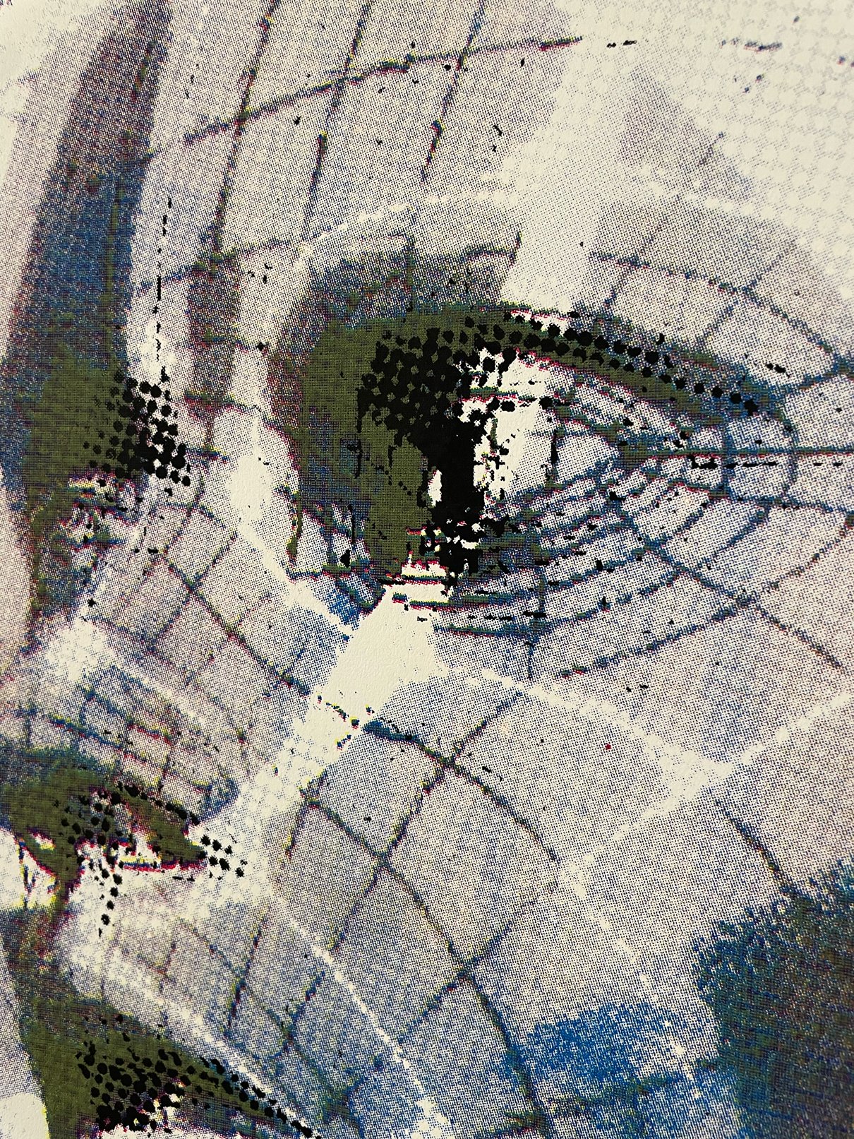
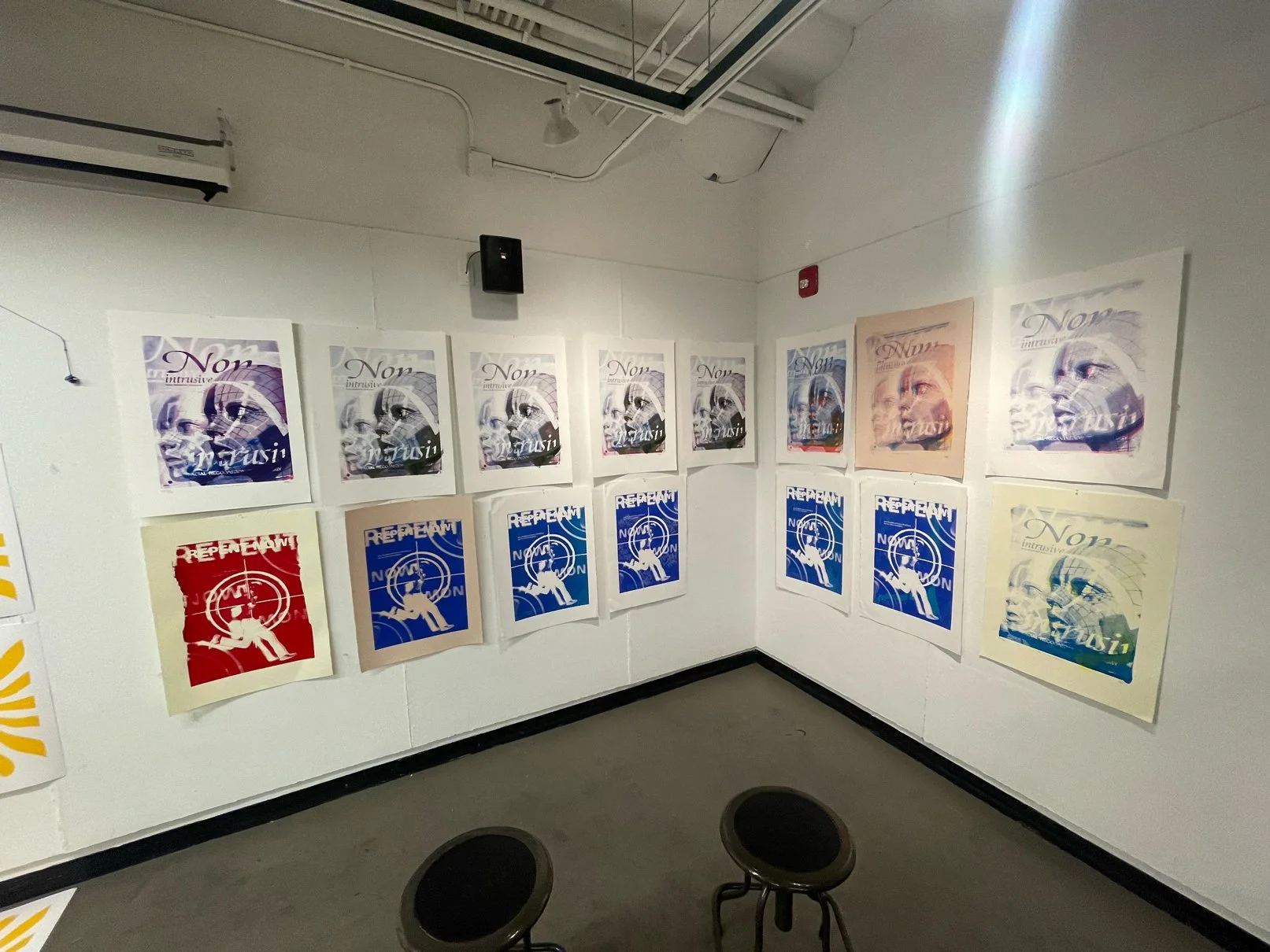
My BFA capstone project, “Under the Guise of Security”, revolved around the idea of ownership and security inside a dystopian future where most have been priced out of the economy. I designed two propaganda posters, and a made-to-scale balsa model named “The Babble of Truth”. The Babble of Truth served as a rehabilitation center for those whose social credit score dips below what is deemed acceptable in this fictional reality. The poster on the left serves as propaganda for the new facial recognition tech that keeps the new cities safe and under control. The poster on the right serves as an advertisement for The Babble of Truth, calling for those with low social credit scores to repent and be rehabilitated into their faction.
Screen Printing


Publication Design
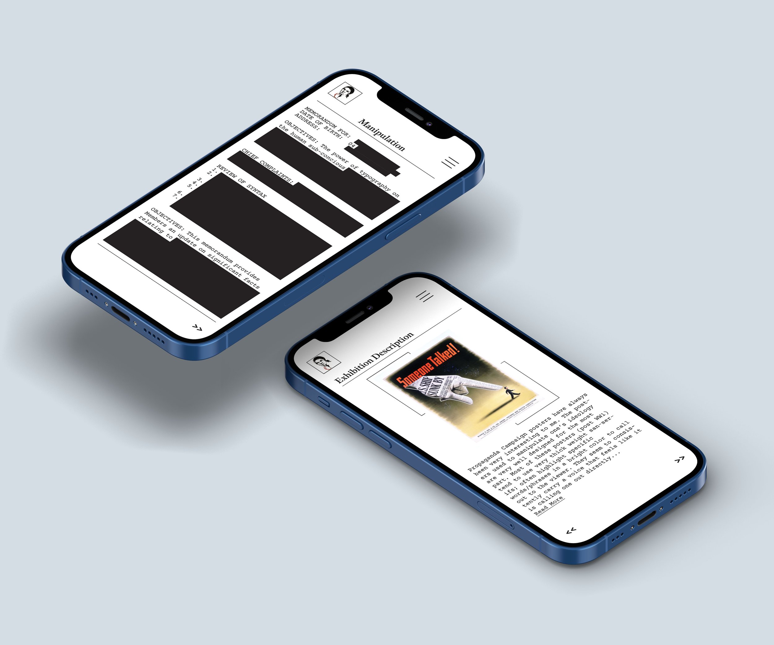
This is a publication that serves as a typographic exhibit, created for my “Typography Projects” class at DePaul. I then translated the material from my physical publication into a micro-site. I explored how different nations and corporations use typography to manipulate the viewer’s psyche. I chose to include examples of Russian and American wartime propaganda, North Korean propaganda, big pharma, and cigarette ad campaigns. The cover was modeled after an FBI dossier where classified information is blacked out.


